Analysing Prometheus Metrics in Pandas
November 13, 2020 - 4 min read
kubernetes
prometheus
pandas
jupyter
I spend more and more time working with Prometheus as it's the default monitoring / metric collection system for Kubernetes clusters at work and other projects i have. It's also a great tool overall i wish i had for longer. Pair it with Grafana and it gives a well integrated monitoring solution:
While a lot can be done with the timeseries data using PromQL and Grafana, i often miss Pandas to easily reorganize the data. Looking around i found prometheus-pandas, a very simple python library that does the job to convert Promethes metrics into Pandas dataframes.
Query Prometheus
In this post i'll use a slightly modified code based on that library to convert the metrics to dataframes, aggregate and reshape the data and finally plot it. Our query's result has two dimensions (cloud and gpu) and includes metrics collected every 15s.
import requests
from urllib.parse import urljoin

api_url = "http://localhost:1111"

# Base functions querying prometheus
def _do_query(path, params):
    resp = requests.get(urljoin(api_url, path), params=params)
    if not (resp.status_code // 100 == 200 or resp.status_code in [400, 422, 503]):
        resp.raise_for_status()

    response = resp.json()
    if response['status'] != 'success':
        raise RuntimeError('{errorType}: {error}'.format_map(response))

    return response['data']

# Range query
def query_range(query, start, end, step, timeout=None):
    params = {'query': query, 'start': start, 'end': end, 'step': step}
    params.update({'timeout': timeout} if timeout is not None else {})

    return _do_query('api/v1/query_range', params)

# Perform our query
data = query_range(
    'sum by(cloud, gpu) (duration{workload="fitting"})',
    '2020-11-12T11:15:39Z', '2020-11-12T12:19:10Z', '15s')
data
Inspecting the results we can see the json format returned.
    {'resultType': 'matrix',
     'result': [{'metric': {'cloud': 'aws', 'gpu': 'k80'},
       'values': [[1605180639, '4.102823257446289'],
        [1605180654, '4.102823257446289'],
        ...
      {'metric': {'cloud': 'google', 'gpu': 'v100'},
       'values': [[1605181374, '0.8236739635467529'],
        ...
        [1605183234, '0.8240261077880859']]}]}
This format is verbose but very easy to handle in Python.
Pandas Dataframes
From here to a Pandas dataframe only takes a couple lines. prometheus-pandas supports scalar, series and dataframes but in this case we need to build a MultiIndex, so here's a slight variation of the function available in the library.
import numpy as np
import pandas as pd

# Prometheus range query giving a Pandas dataframe as output
df = pd.DataFrame({
        (r['metric']['cloud'], r['metric']['gpu']):
             pd.Series((np.float64(v[1]) for v in r['values']),
                    index=(pd.Timestamp(v[0], unit='s') for v in r['values']))
        for r in data['result']})
df.head(1)
| aws | azure | cern | |||||||||||||
|---|---|---|---|---|---|---|---|---|---|---|---|---|---|---|---|
| k80 | m60 | t4 | v100 | k80 | m60 | p100 | p4 | t4 | v100 | k80 | p100 | p4 | t4 | v100 | |
| 11:15:39 | NaN | NaN | NaN | NaN | NaN | 2.1 | NaN | NaN | NaN | NaN | 4.0 | NaN | NaN | NaN | NaN |
Let's take this timeseries and calculate the mean still using our MultiIndex from above.
df2 = df.mean()
df2
aws     k80     4.081384
        m60     3.011447
        t4      2.046543
        v100    0.823264
azure   k80     4.076168
        m60     2.182651
        p100    0.792160
        p4      1.626118
cern    t4      2.034331
        v100    0.675767
google  k80     4.103761
        p100    0.816900
        p4      2.721993
        t4      2.059852
        v100    0.823929
dtype: float64
Shuffling Data
The next and last step is to reorganize the data so we can plot clouds vs gpu cards. To do that we need to pivot (unstack) our hierarchical index - for the table view we can unstack with 1 level, and we'll also highlight the best result per cloud (in this case the best result being the minimum value).
# Unstack to plot clouds against gpus, and
df3 = df2.unstack(level=1)
df3[['m60', 'p4', 't4', 'k80', 'p100', 'v100']].style.highlight_min(
    color='lightblue', axis=1).format("{:.2e}", na_rep="n/a")
| m60 | p4 | t4 | k80 | p100 | v100 | |
|---|---|---|---|---|---|---|
| aws | 3.01e+00 | n/a | 2.05e+00 | 4.08e+00 | n/a | 8.23e-01 |
| azure | 2.18e+00 | 1.63e+00 | n/a | 4.08e+00 | 7.92e-01 | n/a |
| cern | n/a | n/a | 2.03e+00 | n/a | n/a | 6.76e-01 |
| n/a | 2.72e+00 | 2.06e+00 | 4.10e+00 | 8.17e-01 | 8.24e-01 |
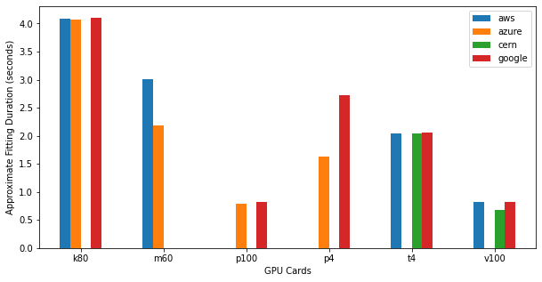
And just as easily we can plot the results, just setting levels to 0 when unstacking.
# Plot
fig, ax = plt.subplots(figsize=(10, 5))
plt.legend(loc=2, fontsize='x-small')

ax.set_ylabel('Approximate Fitting Duration (seconds)')
ax.set_xlabel('GPU Cards')
df3 = df2.unstack(level=0)
df3.plot.bar(rot=0, ax=ax)
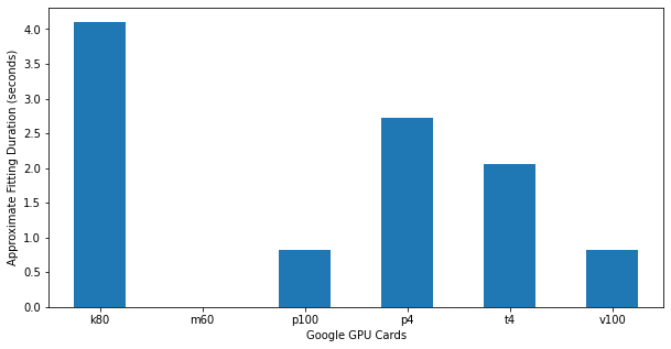
Plotting data for a single cloud is similarly easy.
fig, ax = plt.subplots(figsize=(10, 5))

ax.set_ylabel('Approximate Fitting Duration (seconds)')
ax.set_xlabel('Google GPU Cards')
_ = df3['google'].plot.bar(rot=0, ax=ax)
There are likely cases where the conversion is trickier, but even with more than one dimension it is possible (and very useful) to handle the data with Pandas and dataframes.